p o r t f o l i o
Curated selections from my body of work
Visual
identity design

A great logo strikes the perfect balance between simplicity and sincerity, leaving a lasting impression.
As the cornerstone of a brand’s identity, it merges typography, color, and other visual elements into a cohesive whole. When done right, a visual identity not only resonates with an audience but also fosters a sense of trust and credibility, ensuring consistency
across the board.
➤ Let's Do India
➤ Artist's Quest
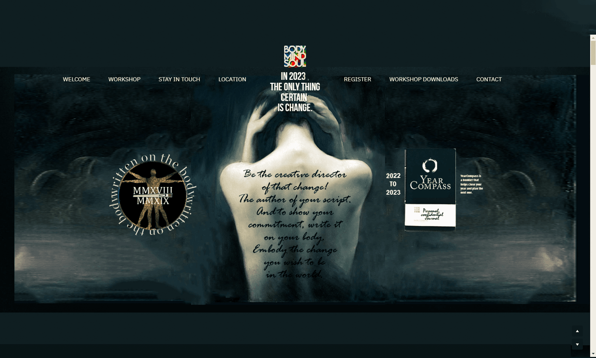
➤ Written on the Body
➤ Quantum Skin Therapy
➤ BodyMindSoul
➤ Book Cover Design & Interior

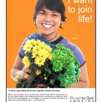
➤ Proud to Quit Smoking
➤ Let's Do India
➤ Newsmagazines
➤ Unexpected Consumer Reactions
➤ Breaking Academic Tradition
➤ Flora & Fauna
➤ Airbnb Interiors
➤ BodyMindSoul
➤ Galt Museum & Archives
p o r t f o l i o :
Let's Do India!
Your gateway to a journey of a lifetime!
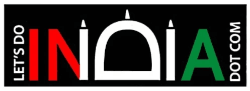
The logo created by Jorgensen Designs for Let's Do India effectively communicates the company's focus on high-end luxury travel to India, and is highly memorable. The letters in "INDIA" are cleverly utilized to suggest the architectural outline of the Taj Mahal. The word "INDIA" has been modified to resemble a simplified version of the Taj Mahal, one of the most iconic architectural landmarks in the world and synonymous with India. It ranks second in a list of one of the most recognized and beautiful buildings in the world.
The letter "D" mimics the central dome of the Taj Mahal, while the vertical lines of the "I"s resemble minarets. This is an intelligent, symbolic choice because the Taj Mahal represents the rich cultural and historical heritage of India, aligning well with a company that organizes luxury travel.
Color Scheme:
The colors used are the same as those found in the Indian flag, which are:
- Saffron (orange/red): Associated with courage and sacrifice, it also has a regal and vibrant tone which fits a luxury brand.
- White: Denotes peace and purity, and works well to keep the design clean and balanced.
- Teal: Represents growth and prosperity, a positive and hopeful color, while also tying to the natural beauty of the country.
The black background helps these colors pop, making the logo stand out with a bold contrast. It adds to the premium, luxurious feel of the brand.
Textual Arrangement & URL Incorporation:
The vertical placement of “LET’S DO” to the left and "DOT COM" on the right helps to frame the core element, "INDIA."
The use of "DOT COM" makes the logo function both as a brand name and a URL, integrating the digital identity seamlessly into the design.
Brand Identity & Target Audience Alignment:
The overall look conveys sophistication and modernity, which is essential for a company dealing in high-end luxury travel. The use of the Taj Mahal suggests that the company offers not just vacations, but a luxurious, culturally immersive experience that would appeal to affluent travelers.
Marketing objectives:
Expand reach: The other objective of the site is to expand the company's reach beyond word-of-mouth referrals to connect with travelers globally.
A competitive analysis: An analysis of Let's Do India's top competitors who offer customized trips to India was performed, and their strengths and weaknesses were identified. A unique competitive offer was identified for Let's Do India.
Quality of design and content: The quality of graphic design and content on the newly designed site cannot be matched by major competitors, giving Let's Do India an advantage.
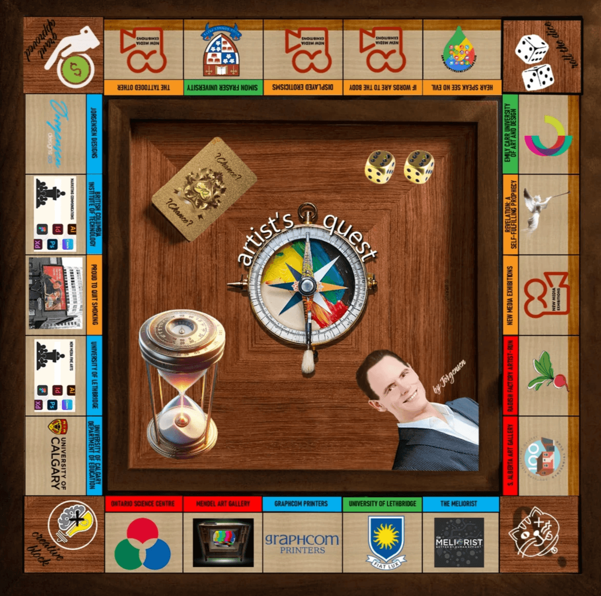
Artist's Quest
Experience the adventure!
Artist's Quest is an online game board that aims to breathe life into the mundane details typically found in resumes and portfolios, transforming them into a vibrant, lived adventures. This game encapsulates a dedication to fostering creativity, promoting meaningful education, weaving compelling narratives, and crafting engaging design that leaves a lasting impression on players.
Symbolic effectiveness:
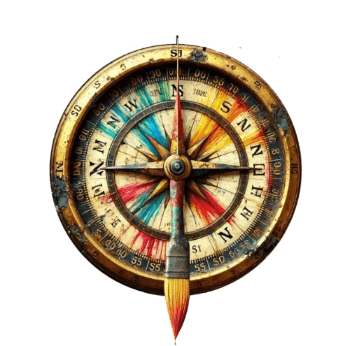
The compass symbolizes exploration and direction, aligning perfectly with the concept of an artist’s journey or quest. It is a traditional compass, one that relies on magnetic north and south, rather than a GPS or digital device used today, so it implies a mythical and ideologically romantic goal, aligning itself with the seafarers of old and comparing it to the quest of modern artists engaged in artmaking.
The artist's quest and the sailor adventurer's journey share striking similarities, both embodying the spirit of exploration and the pursuit of the unknown. Like seafarers of old, artists embark on creative voyages, navigating uncharted waters of imagination and expression.
Both artists and sailors venture into unexplored territories. While sailors sought new lands and civilizations beyond the horizon, artists delve into the depths of their creativity, seeking novel ideas and forms of expression. Just as sailors braved treacherous seas and unpredictable weather, artists confront creative blocks, self-doubt, and technical hurdles. Both must possess resilience and adaptability to overcome these obstacles.
Sailors relied on compasses and maps to guide their journeys, while artists use their intuition, skills and artistic vision as their navigational tools. Both must trust their instruments to reach their destinations. The promise of fame, riches, and new discoveries motivated sailors of old. Similarly, artists are driven by the potential for recognition, creative breakthroughs and the discovery of unique artistic expressions.
The Artist as a Modern-Day Explorer:
In many ways, the artist's studio is akin to a ship's deck – a launching point for creative expeditions. Each blank canvas or lump of clay represents an uncharted island waiting to be discovered. The artist, like the sailor, must summon courage to embark on each new project, facing the unknown with a mix of excitement and trepidation. Just as sailors returned with tales of distant lands and exotic treasures, artists bring back visual narratives and emotional experiences from their creative journeys. Their works serve as maps for others to explore new realms of thought and feeling. The game board, reminescent of Monopoly, has used stained wood as a finish and includes a darker wood frame in which the game board sits. It gives it the appearance of a more expensive and traditional game, one you might find aboard the ship's game room.
In conclusion, the artist's quest and the sailor's adventure are kindred spirits, united by a shared passion for exploration, discovery, and the courage to venture into the unknown. Both embody the human drive to push boundaries, seek new horizons, and return with treasures that enrich our collective experience.
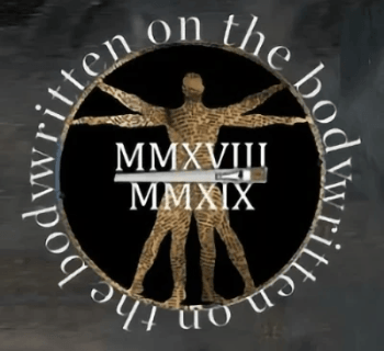
Written on the Body:
Embody your story, author your life.
The logo for “Written on the Body” shows how simple symbols can convey complex ideas. A skilled graphic designer uses symbols like a second language, finding connections between seemingly unrelated events and ideas. This story illustrates how a creative mind navigates toward solutions.
This workshop emerged from my graduate studies, exploring the relationship between words and the body, particularly tattooed words. How do they interact, and what dialogues arise? This can be seen as “mind vs. feeling” or “nurture vs. nature.”
I created a multimedia exhibit, “The Tattooed Other,” examining the role of tattooing in the lives of six individuals. Despite our evolution from tribal societies to the information age, tattooing remains relevant. I found that people turn to tattoos after transformative life experiences, using symbols to map and embody these changes.
In an age of abundant information, where tragedies and gossip coexist, meaning can be lost. The profound and the profane are less distinct.
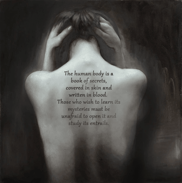
As an artist and activist, I aimed to counteract this. Imagine a workshop where experiences are felt, not just recounted. Each lesson becomes a brushstroke on your future canvas. This workshop helps participants to re-member (make part of the body) allowing the experience to have meaning, and using it to grow, and possibly transforming us.
This workshop would also be helpful to entrepreneurs and company owners. Understanding the motivations that created your company strengthens the unique identity of the business entity you bring to life. By understanding it's relationship to you and seeing it as a separate life, you can clarify its characteristics, which lead to unique business processes and a character that is expressed through branding. In much the way you come to understanding your children.
Symbols effectively embody complex information. They convey ideas, emotions, and concepts through simple, universally recognized forms, transcending language and cultural barriers.
The “Written on the Body” logo is effective because:
- The quill pen symbolizes writing, aligning with the workshop’s introspective approach.
- The feather transforms into a human figure, connecting writing with the body.
- The design’s fluid lines suggest transformation, matching the workshop’s themes.
- The integration of text and image reinforces writing as a tool for personal growth.
Symbolic connection to Vitruvian Man:
- The figure’s pose references da Vinci’s Vitruvian Man, symbolizing ideal human proportions and harmony with the universe, aligning with the workshop’s focus on embodiment.
The logo evokes:
- Intrigue and Curiosity: The unique design sparks interest.
- Connection and Self-reflection: Blending the quill with the human form encourages reflection.
- Creativity and Transformation: The design suggests personal growth.
- Intimacy and Vulnerability: The delicate lines hint at personal storytelling.
- Empowerment and Self-expression: The upward movement evokes empowerment
The design’s simplicity and versatility make it memorable and distinctive. One could even see it as a wax seal stamp, used to certify authenticity in legal documents in the past.
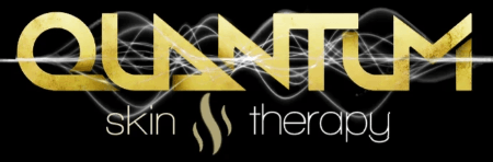
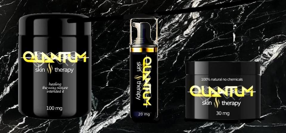
Quantum Skin Therapy. The client, a certified aromatherapist, contacted me to develop a visual identity and logo design for his skin care cream. Members of his family developed rosacea, and regular skin creams only increased the redness and inflammation. He developed a formula made of 100% organic, natural ingredients, with no man-made chemicals which was gentle on their skin. Their skin returned to normal. And he wanted to market this to other sensitive skin sufferers.
I had just finished reading an article about the how our sense of smell may not only be activated by molecules, but also quantum vibrations. Vibrational or energy healing suggests that everything in existence—including human beings—has a unique energy field, and that healing occurs on a vibrational or energetic level. This theory posits that disruptions or imbalances in the body's energy field can lead to physical or emotional illness, and restoring this balance can promote healing. In vibrational healing, it is believed that every part of the body, down to the cellular level, has an optimal frequency. If this frequency becomes disrupted (through environmental toxins, stress, injury, or emotional distress), illness can occur. Healing modalities like Reiki, sound therapy, crystal healing, and aromatherapy aim to recalibrate these frequencies to their healthy state. I suggested using the word "quantum" in his skin cream therpy to recognize the role of quantum fluctuations play in identifying scents and also healing.


BodyMindSoul Bodywork. The phrase “body, mind, and soul” gained popularity in the 1970s, reflecting a resurgence of Indian philosophies that emphasized their interconnectedness. The visual alignment of these four-letter words symbolized their unity, making the concept easily recognizable and metaphorically consistent with holistic philosophies.
The 1960s to mid-1970s hippy counterculture, influenced by European social movements and Eastern spirituality, embraced free love, rock music, shared property and drug experimentation. This lifestyle introduced new perspectives on drugs, freedom of expression, appearance, music and work, promoting liberal political views and opposing the Vietnam War, commercialism, and societal norms. Hippies adopted tie-dye, using secondhand folk and tribal fabrics to create an anti-consumer fashion statement.
The logo’s tie-dye background connects to this counterculture, adding a vibrant, positive energy that stands out. “Bodywork” was included to highlight the massage therapy focus of the company.
For the advertising campaign, a photograph of renowned Moraine Lake’s crystal-clear waters in Banff National Park near Calgary, and the Rocky Mountains’ snow-covered peaks was used, which convey "nature" and "peace." Meditation courses often encourage choosing a place that evokes deep tranquility, perfectly aligning with the brand’s ethos. The "edge" to the image that makes others look at it twice is that the man is floating and could be having a near death experience (NDE). Many designers believe that if an image makes you look twice and requires your brain to think about it, it will be more memorable. It paradoxically communicates both messages.
p o r t f o l i o : web & digital product design

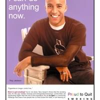
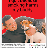
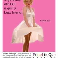
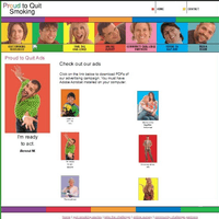
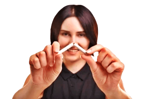
Proud to Quit Smoking
The creative approach, content strategy and deployment required sensitivity to the
social, cultural, and political issues of the audience.
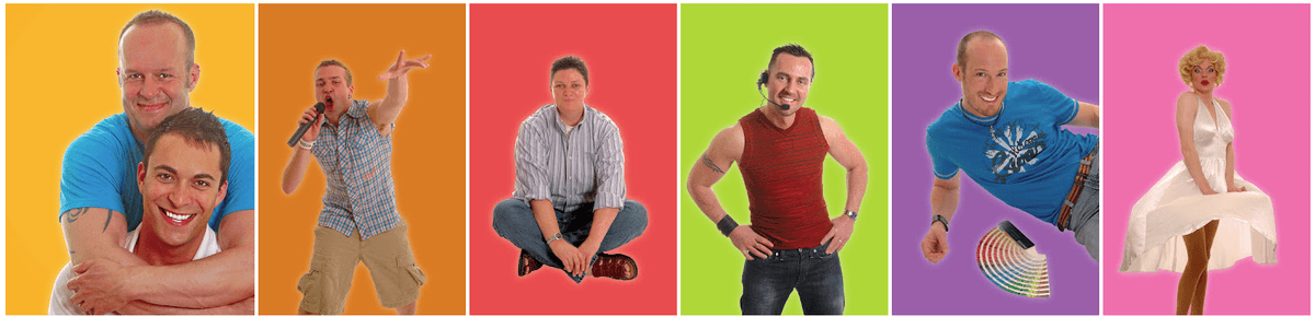
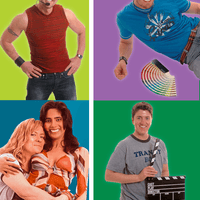
Jorgensen Designs submitted a proposal to an open call for entries and was successfully awarded the contract for Creative Director of the first quit smoking campaign targeting the GLBTQ+ community in North America. This multimedia campaign, conceived by Gay West and funded by Vancouver Coastal Health and Health Canada, was a groundbreaking initiative.
Stephen Rodrozen, the Communications Manager and public face of the campaign, played a crucial role. He kept the media informed, managed advertising, selected influencers, awarded prizes to participants, and meticulously accounted for the campaign’s expenditures.
The campaign spanned six months and included post-campaign marketing research to evaluate its effectiveness. One of the biggest challenges was representing the diverse GLBTQ+ communities in a way that celebrated their diversity and different agendas. A local GLBTQ+ organization formed a committee to review the creative content and provide feedback. Additionally, Health Canada and Vancouver Coastal Health formed another committee to approve the scientific and medical content of the advertising. Gay West also had a committee of interested individuals who reviewed all media before it was made public.
Pleasing so many different stakeholders would be a daunting task for any creative director. The creative approach, content strategy, and deployment required sensitivity to the social, cultural, and political issues of the targeted audiences. Their agendas included identity politics, control over self-representation, full inclusivity, and racial diversity. Researching the missions of the organizations and the wide spectrum of individuals in the GLBTQ+ community was essential. The social and political theory studied during my interdisciplinary fine arts degree was crucial to the campaign’s success.
To avoid critique regarding GLBTQ+ representation and stereotypes, the most simple approach was to use real individuals and influencers from different the different communities .
The campaign featured 24 influencers who chose how they wished to be photographed for 24 different advocacy ads found in print and online media.
Since the LGBTQ+ community is relatively small and the campaign focused on the downtown West End, where many GLBTQ+ individuals live, an added benefit was that the influencers were likely to be recognized and lent credibility to the campaign.
Using a ‘gay voice’—one that employs self-effacing humor—in the advertising helped unify the different communities while engaging the audience with a serious health topic.
All materials were approved by the three committees without a single change.Even Health Canada scientists approved our first submission of the Quit Smoking Kit without any corrections.
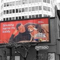
Jorgensen Designs produced over 30 full page print ads, 5 billboards placed in key areas of the downtown West End and other key areas of Vancouver. Print ads ran in Xtra-West, Vancouver Sun, Vancouver Herald, and several community newspapers. A full, interactive website was created by Jorgensen, prizes for those who shared their stories online about tobacco cessation or reduction were given, a “Proud to Quit Smoking” kit was developed, and public bathroom advertising poster space was purchased. Downloadable quit smoking tips and stories from influencers about quitting or reducing their tobacco consumption were available online to provide support to others quitting, along with an online survey and a contest with a $250 prize.
Post-campaign market research revealed that in downtown Vancouver, campaign recognition achieved 86%, and 68% of GLBTQ tobacco users had ceased or significantly reduced their tobacco usage. The marketing specialists who conducted a Brand Awareness Survey and Campaign Effectiveness Survey presented their findings at a media event at the end of the Proud to Quit Smoking campaign.
Health Canada reiterated that it was one of the most effective tobacco cessation programs they had ever funded. The campaign was sincerely appreciated and supported by the LGBTQ+ community. Other cities in North America inquired about using the campaign design as a template.
From every point of view, Proud to Quit Smoking was not only a huge success, it united a very diverse community.


EXCERPT FROM HANDOUTS
How to Quit
WHEN IT COMES TO BUTTING OUT, you don’t have to go it alone.
There are quit-aids available to suit every personality and preference –
from alternative therapies to medical interventions.
Which one suits your style?
Pharmaceutical Methods Brupopion:
This prescription anti-depressant medication inhibits the release of dopamine and noradrenaline in your body, which helps to prevent cravings, withdrawal symptoms, and weight gain that often accompanies giving up cigarettes. It is used by people with or without a history of alcoholism or depression. Studies also support the use of Brupopion in combination with NRT and other quit techniques.
This medication should not be used by someone who experiences seizures. Known side effects of over-dose include rapid heart rate and convulsions. Mild effects include dry mouth and insomnia, and allergic reactions occur in 3% of patients who use Brupopion. Bruponion can also cause sexual side effects including decreased libido and inability to climax. Talk to your doctor to learn whether Brupopion is right for you.
Nicotine Replacement Therapy (NRT):
NRT is used to gradually reduce the amount of nicotine in your bloodstream, and eventually wean you from the chemical addiction. Studies show that using NRT in the form of a gum, inhaler, lozenge, nasal spray or patch increases your chances of success almost twofold.
On the downside, while using NRT may help break your chemical dependency, it does not help with behavioural addiction. You still need to find ways to reinforce non-smoker behaviour as you wean from nicotine. As well, some users report insomnia and nausea as a result of NRT.
Natural Alternatives Acupuncture:
Not convinced that this traditional medicine has a place in your quest to quit? You might be surprised to learn that several studies show an average 40% success rate with acupuncture. Researchers suggest that the ancient practice of inserting tiny needles into certain points in the body redirects the flow of energy and helps to increase production of mood-enhancing endorphins, which can ease symptoms of withdrawal. Other studies suggest that acupuncture works by reducing patient’s taste of tobacco and the desire to smoke. Acupuncture is economical, and has no dangerous side effects. Combined with counseling, acupuncture is an excellent and economical alternative to medication.
Herbal Remedies:
If the idea of supplying your body with more nicotine as you try to break the habit doesn’t make sense to you, herbal remedies might answer your need to keep the cravings under control without adding drugs to your system. And with the variety of herbal preparations and delivery methods available, you should be able to find a system to suit your individual needs! Look for herbal patches, tonics, gums, sprays and teas that help to cut the cravings, ease withdrawal and calm your nerves.
Although individual formulations will vary, here is a list of some of the most common herbs used to kick the habit:
Eucalyptus is approved by the American FDA as an expectorant. It is both anti-bacterial and anti-viral, and helps to soothe the bronchi.
Licorice Root helps to calm inflammation in the airways, removes phlegm and relieves coughing.
Lobelia is an herbal systemic relaxant that is used in treatment of respiratory conditions.
Marshmallow is soothing to the respiratory tract and is useful for treating coughs. Plantain helps to reduce nicotine cravings while supporting the respiratory system. Slippery Elm calms cough and helps to soothe the throat. And don’t be fooled into thinking that smoking a clove cigarette is a safe alternative to the real thing. Clove cigarettes can contain up to 60% tobacco, and burning clove releases carcinogens.
Homeopathy:
As a holistic form of therapy, homeopathy treats your health as a whole rather than focusing on a particular body part. It is a method of healing that provides a “spark” for your body to start your own healing process. It works through the principle that “like cures like,” meaning that a substance that could cause symptoms in large amounts can heal you in small doses. Because every body is individual – and people experience different withdrawal symptoms – various remedies are available.
aaa
Below is a small list of remedies that might help you on your quest to quit. Visit a homeopath, naturopath or a knowledgeable health products store for more details. Remember, this list is for information only, and should not be construed as medical advice.
Nux Vomica is useful for congestion, cough, tiredness, and cravings for tobacco.
Plantago Major helps to reduce tobacco cravings. Staphysphagria helps with cravings, insomnia and irritability.
Hypnosis: Although the studies of hypnotherapy as a stop-smoking aid have mixed results, many people find success with the use of this alternative therapy. A study conducted at Ohio State University concluded that 22% of participants were able to kick the habit. A 2002 survey found that 76% of participants who had used hypnosis to help them kick the habit found the treatment to be effective. Many studies conclude that, at worst, hypnotherapy can’t hurt!
Nutritional Therapy:
- No matter what quit-aid you choose, help your body to heal with a diet that is high in antioxidant- rich fresh fruits and vegetables to strengthen your immune system and shorten your recovery time.8
- Common antioxidants include vitamin A, vitamin C, vitamin E and selenium. Green tea is also a valuable source of healing antioxidants, and you would benefit from drinking at least one cup per day.
- Be sure to get adequate lean protein in the form of chicken, turkey and fish, or from the vast array of legumes including chick peas, kidney beans and lentils. Protein is essential for building a strong immune system. Snack on nuts and seeds to improve your intake of healing essential fatty acids (EFAs). EFAs reduce inflammation and promote cellular healing.
- Supplement your healthy diet with a broad spectrum multi-vitamin to be sure to make up for any nutritional deficiencies in your diet. You’ll be feeling your best in no time!

Let's Do India!
Your gateway to a journey of a lifetime!
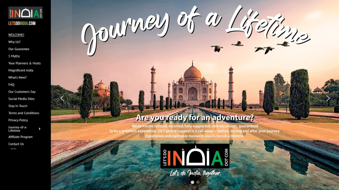
Jorgensen Designs recently reimagined the branding for Let’s Do India, elevating their logo, website, and marketing collateral to reflect the high-end, personalized experiences they offer. The refreshed design features a bold, script-style headline—“Journey of a Lifetime”—that instantly captures attention and evokes a sense of adventure and discovery. Paired with the compelling call-to-action, “Are you ready for an adventure?”, the design seamlessly invites user engagement, encouraging visitors to delve deeper into the site.
A breathtaking photo of the Taj Mahal serves as the visual centerpiece, establishing an exotic, historic, and adventurous atmosphere that speaks directly to the aspirations of potential travelers. Warm, vibrant tones weave through the site’s design, mirroring the richness and beauty of India itself.
The redesign also aimed to expand Let’s Do India’s visibility, moving beyond word-of-mouth recommendations to capture a global audience of explorers. A comprehensive analysis of the brand’s competitors, who also specialize in curated trips to India, revealed key opportunities. This allowed Let’s Do India to carve out a distinctive niche, with a refined graphic design and
content quality that surpasses major competitors—giving them a significant edge in the market.Jorgensen Designs recently enhanced the web and digital product design of Let’s Do India, by redesigning their logo, website, and postcard reminder to better reflect the high-end services they offer. The new design and content addresses the results of research conducted with potential and past clients into their fears and concerns with traveling in India, and identifies how the company overcomes each one with its unique approach, features and benefits. With these insights, developing the content and a unique brand is nearly effortless.
The home page perfectly sets the stage to the services of Let's Do India by introducing the incredible mystery and beauty of India through new striking photographs of the Taj Mahal. The wishes and desire of the travelers are clearly identified and promised fulfillment with its headline, “Journey of a Lifetime.” These immediately grab attention and convey a sense of adventure. The question, “Are you ready for an adventure?” encourages user interaction and invites visitors to explore the website further.

Addressing travelers' concerns about service quality
An informal survey was conducted among past clients and current clients, and it was discovered that one of the main concerns of potential travelers to India is that service providers do not live up to their promises.
- This is addressed in the section, "How we guarantee a premium travel experience." There are six different concerns addressed in each section of the content. The following is a sample of the content they provide:
- "Trusted experts: Whether travelling with a group concierged by the owners of the company, or adventuring with a customized package, the traveller's needs are priority. Each travel package is overseen by experienced service people who are thoroughly screened, hand-picked and offer premium services. You are assigned a personal travel assistant who can be reached by toll free phone, 24 hours a day, in case any challenges, conflicts or help is needed. They are trusted experts who prioritize safety and comfort. Let's Do India owners know them personally, and have years of experience working with the company."

Busting travel myths about India
- Informal survey reveals five key concerns among potential travelers. Concerns largely influenced by media reports or past visitors' experiences.
- Let’s Do India identifies these concerns as myths. Let’s Do India focuses on addressing each myth in written and video content.
- Provides reassurance and practical solutions for a seamless, stress-free experience.
- Compelling video testimonials from past clients. Testimonials provide firsthand accounts of the company's reliability. Testimonials highlight the joy of a well-orchestrated Indian adventure.
- Reinforces Let’s Do India's commitment to delivering unforgettable, worry-free travel experiences. Solidifies the company as a trusted partner for exploring India. Video and testimonials build credibility and address audience concerns.
- Emphasizes ability to tackle client objections with thoughtful design and strategic content.

Meet Taron Puri and Madhu Duggal: Your expert guides to India
What sets Let’s Do India apart from similar competition are the extraordinary accomplishments and vibrant personalities of the owners, Taron Puri and Madhu Duggal. They create a human connection that fosters trust and loyalty for travelers. They hosts the group tours, and select and approve every aspect of individualized tours with virtual hosts.
Let Taron and Madhu guide you through the heart and soul of India. With over 22 years of experience hosting the Journey-of-a-Lifetime Adventure, they offer:
- Authentic experiences that go far beyond typical tourist paths
- Personalized itineraries tailored to individual preferences
- Exclusive access to local markets, artisans, and culinary treasures
- Let’s Do India provides a connection to the soul of India through two extraordinary hosts who have spent decades perfecting the art of creating meaningful, transformative travel experiences.
Taron’s highlights:
- After a successful legal career, including a distinguished role as an Immigration Canada judge, he answered a deeper calling—as a healer, teacher, and personal coach.
- With a lifetime dedicated to the study of Indian spirituality and culture, Taron brings profound insight to every journey.
- Author of Finding the Guru Within (1992)
- Host of a widely-followed podcast on healing and spirituality
- Creator of transformative retreats and seminars
- Intuitive guide with deep insights into health, emotions, and personal growth
- Traveling with Taron offers guests a rare perspective on India, enriched by his intuitive abilities and his expansive knowledge of the country’s spiritual heritage. Each adventure becomes a path of discovery, both within and beyond.
Madhu Duggal: Culinary expert and shopping guru
- Madhu complements her brother’s spiritual depth with her vibrant love for Indian culture, cuisine, and commerce.
- Her engaging personality and connections to India’s bustling markets make her an expert guide for those seeking the country’s best-kept secrets—whether it's the perfect dish or the ideal souvenir.
- Expert in a wide array of Indian cuisines, from street food to fine dining
- Savvy shopping guru with an eye for uncovering hidden gems and great deals
- Master at curating personalized experiences that cater to individual tastes
- Attentive host known for her warmth and attention to detail
- With Madhu at your side, every aspect of your journey will be carefully tailored to your preferences, ensuring an experience that is both memorable and deeply personalized.

Engage, inform, sell, and convert:
The multi-layered strategy of newsmagazines
One of my key projects involves designing natural health "newsmagazines" to highlight specific products. These are created by Purity Life Health Products, a large North American natural health manufacturer and distributor. To drive consumer demand, the newsmagazines feature select products along with current research and use information.
Over 50 million copies are distributed across four countries, significantly boosting product sales. The campaign includes a toll-free number for consumers to find retailers who carry the featured products, request additional information, or sign up for future issues and receive coupons.
This strategy not only builds a highly targeted mailing list but also provides valuable insights into consumer interest and product popularity based on the volume of calls received. It also identifies who these consumers are with demographic data. Marketing demographics include characteristics such as age, geographic location, education level, occupation, income, etc., that are used to create groups and segment a market.
Strategic design and marketing effectively layer function and purpose to achieve multiple goals simultaneously. In the case of natural health "newsmagazines," the most apparent function is to drive demand for products and boost sales. This is achieved by spotlighting key products, educating consumers about their benefits, and creating a sense of urgency to try them.
The second layer of purpose revolves around collecting valuable demographic data. By encouraging consumers to interact with the brand, whether through signing up for future newsletters, requesting coupons, or providing retailer information, companies build a targeted database. This demographic information is essential for refining marketing strategies, tailoring future communications, and expanding the potential audience.
A third and equally important layer is consumer engagement. These newsmagazines foster an interactive experience by inviting consumers to call toll-free numbers for more information, connect with product experts, or locate nearby retailers carrying the product. This not only enhances consumer participation but also deepens their relationship with the brand, building trust and loyalty.
In essence, the design is crafted to engage the consumer at multiple touchpoints, transforming passive readers into active participants and long-term customers. This layered approach ensures that the campaign goes beyond immediate sales to build a lasting relationship with the audience while simultaneously collecting actionable data for future marketing initiatives.
Unexpected consumer reactions
Know thy audience!
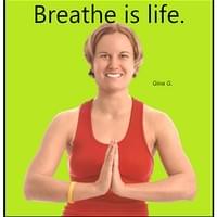
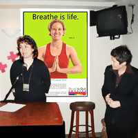
In 2024, it's common to see images of individuals practicing yoga in natural supplement ads. However, when I first introduced this concept for Moducare, it sparked an unexpected reaction. The company received over two dozen complaints from consumers who perceived yoga as a religious practice and were uncomfortable with its presence in a supplement ad. The company's owner, concerned by the negative feedback, considered removing the imagery from future campaigns.
I remained resolute in my vision, explaining that the target audience for Moducare overlapped with those who practiced yoga—both groups focused on holistic health and wellness. The pushback was primarily from older, more conservative consumers who misunderstood yoga's evolving role in modern society. Today, yoga is widely embraced across communities of all sizes—not as a religious practice, but as a means of enhancing flexibility, emotional balance, and physical strength. Its integration into wellness and health is now seen as a natural and effective way to maintain longevity and minimize aging.
Natural health consumers are a unique group, particularly when faced with health challenges. They tend to be deeply invested in researching their conditions and exploring a variety of approaches to healing, often outside of conventional medicine. These individuals prioritize staying informed about cutting-edge scientific research, nutritional supplements, and even traditional remedies. Their desire to understand their health and explore alternative treatments is driven by a quest for autonomy in managing their well-being.
Consumers of natural health products often turn to complementary and alternative medicine (CAM), seeking therapies that address not only the physical symptoms but also their emotional and mental health. This holistic mindset fosters a deep connection between body and mind, and the information they gather helps them feel empowered to make informed decisions about their health journey. CAM therapies, which include practices like acupuncture, herbal supplements, and yoga, have seen increasing popularity as consumers value personalized care with fewer side effects compared to conventional medicine. Many seek these methods as a way to enhance chronic pain management, reduce stress, and prevent future health issues.
For natural health companies, providing up-to-date, credible information is essential in building trust and loyalty among these consumers. Offering educational resources, whether through blogs, newsmagazines, or seminars, allows companies to position themselves as trusted authorities. By doing so, they not only meet the information needs of their audience but also cultivate a dedicated following. These consumers appreciate companies that offer transparency and show a genuine commitment to their well-being, and in return, they are likely to remain loyal.

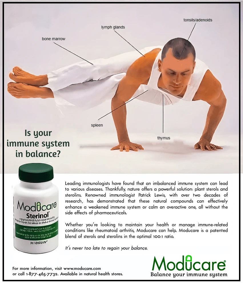
Essential Phytosterolins Inc. (EPI) is the company behind the innovative phytosterolin-based products. I recommended marketing all three products—Moducare, ModuChol, and ModuProst—under the EPI brand in one ad, positioning it as a leader in cutting-edge research and high-standard manufacturing processes to achieve pharmaceutical-grade purity. The brand narrative would encompass all three products, while each maintains its unique identity by targeting specific health conditions like cholesterol reduction and prostate health.
To introduce EPI to the U.S. market, I developed a comprehensive marketing strategy that included print ads, billboards, and newsmagazines. These newsmagazines were distributed through local newspapers and natural health stores, adding a valuable touchpoint to our marketing mix.
EPI quickly became the top-selling brand for phytosterolins in both the U.S. and Canada. Emphasis was given to the purity and evidence-based efficacy of our products. The initial design of our logo, product labels, packaging, and print materials drew inspiration from the pharmaceutical industry. We kept the copy minimal, avoided overt marketing language, and ensured all information was both quantifiable and qualitative. The chosen fonts were clean and scientific, reflecting our commitment to research and precision.
EPI quickly became the best-selling brand for phytosterolins
in the U.S. and Canada.
The purpose of this design strategy was to appeal to logic-based, scientific credibility and efficacy of the product. In the more recent stage of the design, a retail influence has crept back into the strategy with the positive emotional impact of the flower images on the packaging and the bright primary colours. The image of the smiling couple in an intimate moment of emotional connection and the headline: "Because you want to live a long and healthy life" — "with each other" is implied, and is more emotionally engaging than the factual based headline used previously: "Is your immune system in balance?"
While science sells, emotion sells stronger. I think a good balance between the two is achieved.
Breaking academic tradition pays off...
Assistant Dean’s faith in Jorgensen's creative direction results in a
$25 million donation and a 200% increase
in graduate program applications!
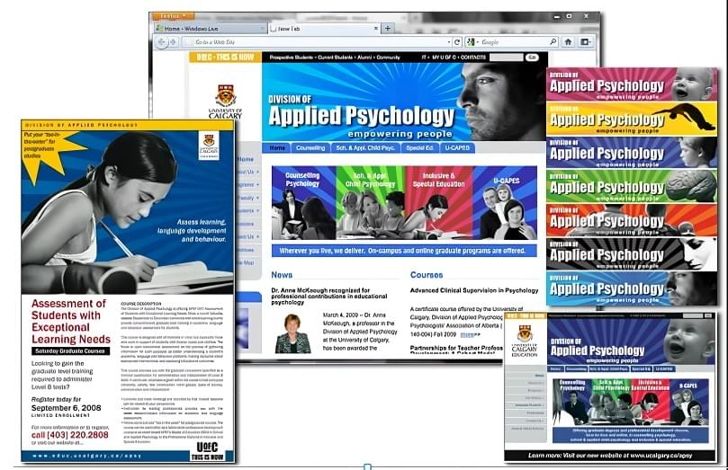
The University of Calgary’s Department of Graduate Educational Research and Applied Psychology is now proudly known as the Werklund School of Education.

After a comprehensive redesign of the University of Calgary’s Department of Education Graduate Studies brand and website, the Associate Dean proudly presented the new look to her colleagues. Their reaction was swift and critical: “It looks too commercial. It will undermine our reputation as a research university.”
Understanding their concerns, I knew they feared the new design might tarnish their academic prestige, making them appear more like a trade school. With my own master’s level education and extensive experience working with universities, I recognized the delicate balance needed. I believed I had achieved it, knowing their apprehension stemmed from unfamiliarity with persuasive advertising design.
She realized the potential professional misstep, especially given her colleagues’ strong opinions. Yet, she trusted her instincts and my expertise in creative direction. “Make the changes and go live with it!” she declared, taking a bold gamble by going against academic tradition and her colleagues’ views.

Rebranding the Werklund School of Education
When the University of Calgary began rolling out a new website design, the massive scale of the institution meant that some departments faced extended delays. The Associate Dean of the Faculty of Education and Applied Psychology, eager to modernize her department’s online presence without waiting, secured approval to hire an independent web designer and marketing specialist—me. My task was clear: create a brand and digital presence that matched the dynamic quality of their graduate programs.
The outdated website was harming their image, portraying the department as stagnant rather than forward-thinking. The Associate Dean envisioned a rebrand that would tell a compelling new story—one that reflected their excellence and vision. This rebranding needed to address not only the Department of Education but also its graduate divisions, each requiring a unique narrative and cohesive visual identity.
Through extensive collaboration, I developed a brand strategy emphasizing:
- Brand foundation language: Clarifying their core message and values.
- Tone of voice: Striking a balance between academic authority and approachability.
- Brand identity: Crafting visuals that resonated with students and faculty alike.
This was about more than design—it was about rediscovering the department’s excitement for its mission and ensuring it shone through in every detail.
Website Redesign
The previous website resembled a relic from the Web 1.0 era, with static content, limited interactivity, and dated aesthetics. My redesign embraced Web 2.0 principles, bringing modern functionality and a vibrant user experience to life. Key improvements included:
Dynamic Design and Enhanced Usability:
- Introduced a sleek, magazine-style layout with modern fonts, color palettes, and expressive photography.
- Rebuilt the site’s structure for easier navigation, linking related content and standardizing tools for consistency.
- Integrated interactive features like preformatted email templates and online forms, simplifying student-professor communication.
- 2.Content Revitalization:
- Encouraged faculty to update profiles with personal and professional achievements.
- Featured interviews with current graduate students to highlight program quality.
- Added a frequently asked questions section to address common inquiries and reduce support calls by 33%.
- Engagement and Resources:
- Introduced event coverage, alumni profiles, and downloadable resources such as applications, timetables, and grant information.
- Integrated multimedia elements, including videos showcasing departmental achievements.
Results That Speak Volumes
The transformation wasn’t just aesthetic—it produced record-breaking outcomes:
- Traffic Surge: Within four months, site traffic increased tenfold, attracting tens of thousands of new visitors globally.
- Application Growth: Graduate applications soared from 923 to 1,865, more than doubling enrollment interest.
- Staff Efficiency: Support staff enjoyed improved workflows, spending more time with students and fostering better engagement.
- Endowment Secured: My work contributed to a landmark $25 million endowment from the Werklund Foundation in 2013, leading to the renaming of the Faculty of Education as the Werklund School of Education.
This project demonstrated the power of strategic branding and thoughtful design in reshaping perceptions and driving measurable success.
Record-Breaking Results: The redesign and strategic online advertising led to a record-breaking number of graduate program applications, jumping from 923 to 1,865.
Visitor Growth: Attracted tens of thousands of new visitors from various regions.
Enhanced Site Structure: Added downloadable resources, improved search capabilities, alumni profiles, and interactive forms.
Reduced Support Calls: Reduced support calls by 33% by addressing common inquiries with a comprehensive FAQ section.
Achieved Endowment: Secured a $25 million endowment for the Faculty of Education through persuasive presentation. My work on the rebranding and redesign of the U of C Department of Education and Applied Psychology, and my help with the proposal, helped to secure a donation from the Werklund Foundation in 2013. The Foundation endowed the University of Calgary’s Faculty of Education with the largest donation ever received by an education faculty in Canada. In recognition of his generosity, the faculty was renamed the Werklund School of Education.

As Web Master and Marketing Communications Specialist, I rebranded the graduate programs for the Department of Education and Applied Psychology. This involved redesigning and rewriting all of their marketing materials and website, creating online advertising, developing social marketing and content.
RESULTS
By rebranding & redesigning the 2 divisions’ websites, advertising and marketing materials, I increased income from courses, maximized enrollment, and improved awareness and reputation of graduate programs. With the website, I improved useability & usefulness, increased site visits, & conveyed the exceptional features and benefits of programs. I gave it: an improved site structure, downloadable forms & materials, a search engine, graduate student profiles, faculty profiles, answers to frequently asked questions, and online contact & feedback forms. Both graduate programs received the most applications to their graduate programs than they ever had in their history of their operation! My presentation design helped the Faculty of Education secure a $3.1 million dollar endowment from the Werklund Found.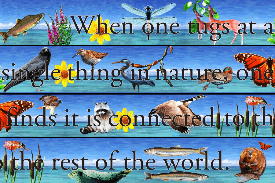
Flora and Fauna
Outdoor Art Commission for Pier Redevelopment,
City of New Westminster, BC
January 2012
Imagine contributing to a city’s architectural development that celebrates and sustains its local flora and fauna, while engaging young minds through play! This vision inspired me to submit my proposal to the City of New Westminster in BC, and I was thrilled to be selected for this unique project.
For the Pier Redevelopment, I created an outdoor mural featuring iconic images of flora and fauna native or naturalized to the area. This mural was commissioned by the City of New Westminster and designed in collaboration with biologist Gary Williams from GL Williams & Associates, ensuring scientific accuracy and geographic relevance.
The mural was crafted using digital photography-based applications, printed in full color, and sealed with a durable plastic coating to withstand all weather conditions throughout the year.
A phrase that perfectly encapsulates the spirit of this project is: “When one tugs at a single thing in nature, one finds it connected to the rest of the world.” Though it sounds like a famous quote, my research revealed it has no specific attribution. This phrase beautifully aligns with the eco-friendly design of the pier, the playful depiction of flora and fauna, and the inspiration to appreciate the interconnectedness and importance of nature in our lives.
The final three images in my portfolio showcase the site before redevelopment and the building plans for the children’s park where the mural is displayed.


Artist's Quest
A Unique Journey into the
Development of a Creative Professional
Note: The project is only 50% completed. Please check back November 9, 2024.
Embark on a captivating journey with Artist's Quest, a game designed to immerse players in the world of Jorgensen's art and design education, experience and inspiration through an interactive and engaging exploration process. Tailored specifically for hiring committees as part of Jorgensen's innovative employment application, this board game promises a one-of-a-kind experience.
Select your character from a diverse array of options, including male and female artists, male and female art history professors, or opt for the mysterious theater arts masked character to keep your identity concealed and add an element of intrigue to your gameplay.
Much like the unpredictability of real life, time becomes a crucial factor as you flip the hourglass to initiate the countdown. Navigate through the game by rolling the dice and accumulating valuable resources such as gold, copper, silver, and titanium bars as you traverse through educational institutions, workplaces, art galleries, and exhibitions.
Venture into the realm of Chance, symbolized by Schrödinger's cat, where the cards you draw can either propel you towards victory or present unforeseen challenges. While there's no risk of ending up in jail akin to Monopoly, a creative block might hinder your progress, causing you to miss a turn. Skillfully leveraging your connections or showcasing your innate talent can lead to substantial rewards, such as earning bonus points with a "Grant Approved" outcome or securing an extra turn with a stroke of luck from "Roll the Dice."
As the sands of time dwindle away, each player gets one final opportunity to make their mark on the game. Tally up your achievements, each assigned a symbolic dollar value representing points accrued rather than monetary wealth. The player with the most significant accomplishments, reflected in their amassed points, emerges victorious.
The essence of being an artist lies in transcending conventional societal norms and embracing a mindset that defies traditional boundaries. Unlike the conventional pursuit of accumulating wealth as seen in Monopoly, true success transcends material possessions and monetary gains. Success in the artistic realm is not solely defined by educational qualifications, exhibition history, or work experience; rather, it is a fusion of raw talent, innovation, and a unique perspective that paves the way for recognition and acclaim.
Artist's Quest challenges players to rethink the conventional notions of success, urging them to question standardized benchmarks and discover that winning holds diverse meanings for different individuals. Artists are adept at challenging societal norms, redefining success, and evolving their understanding of art and achievement as they progress through life.
Through Artist's Quest, Jorgensen aims to breathe life into the mundane details typically found in resumes and portfolios, transforming them into a vibrant, lived experience. This game encapsulates Jorgensen's unwavering dedication to fostering creativity, promoting meaningful education, weaving compelling narratives, and crafting engaging designs that leave a lasting impression on players.


